Embers of the Crown
User Interface
Embers of the Crown » Devlog
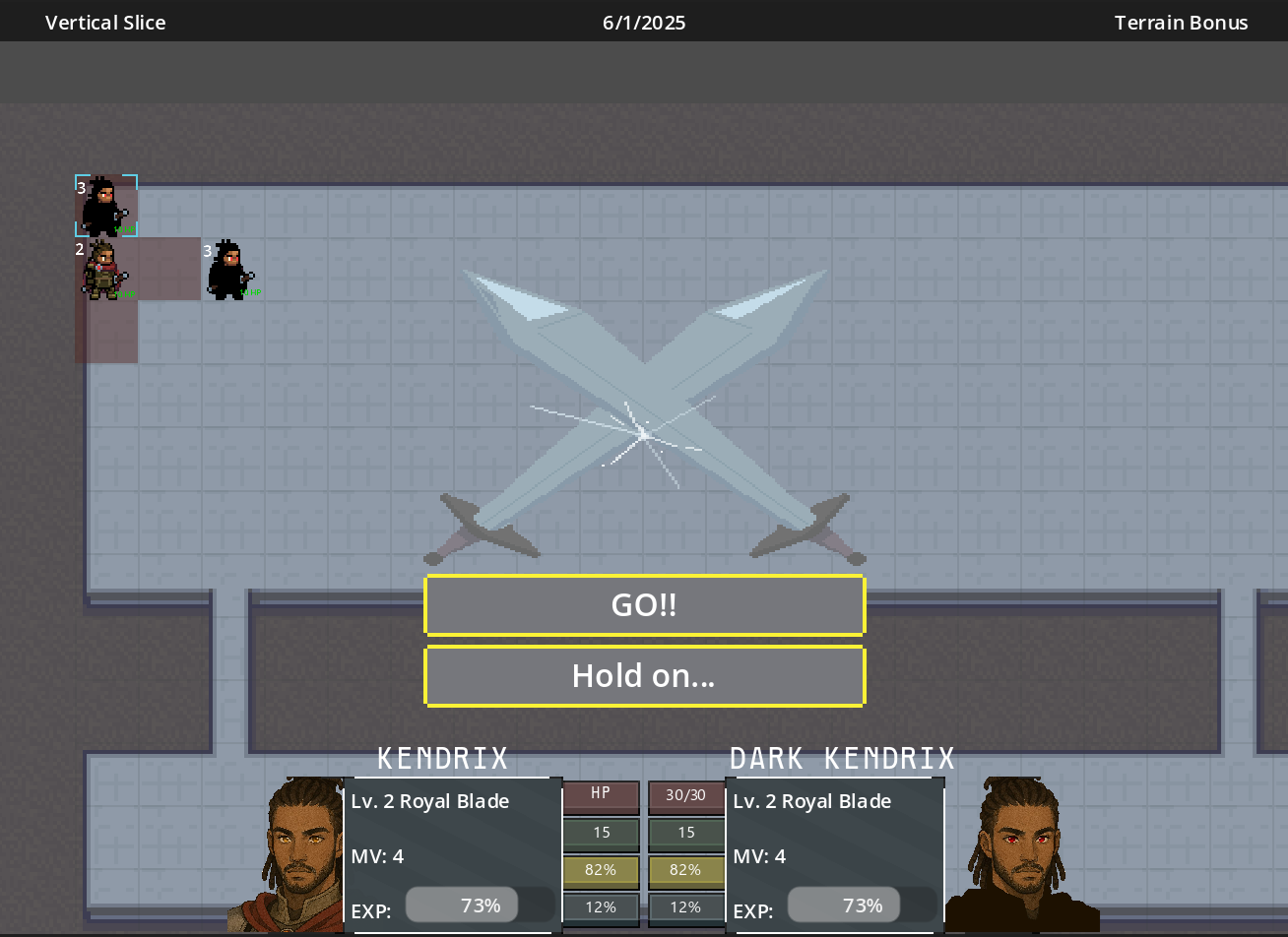
Really been iterating through the different design ideas for the UI to get something easy to read and looks good without following the traditional Fire Emblem style. Landed on the screenshot attached. I think this portraits information super well. Been experimenting with shaders too, added a slight (but nice) touch to the interface!
Another idea was to frame the viewport to allow for easy to see information (terrain bonuses, current chapter of storyline, tips, etc.).
All in all, I think this update did a good job at making the game feel less of a demo and more of a vertical slice!
Embers of the Crown
More posts
- Artist's found!Jul 08, 2025
- Tilemap & Cutscenes!Jun 08, 2025
- Polish and vertical slice piecesJun 04, 2025
- Big Combat Update!May 26, 2025
Leave a comment
Log in with itch.io to leave a comment.